Clean water as a brand, not a technical catalogue
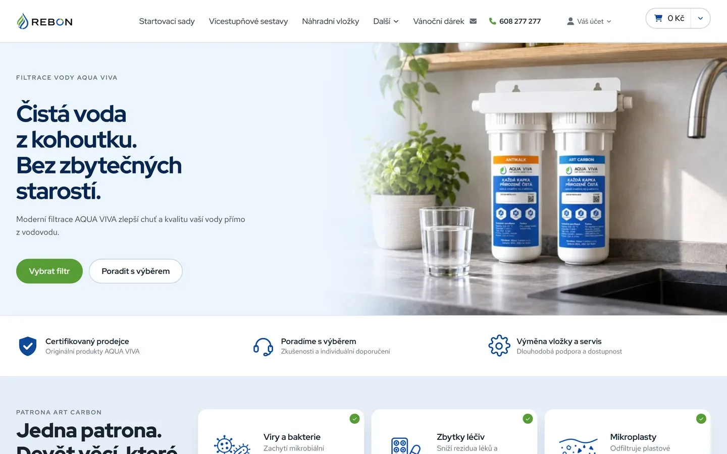
Rebon sells domestic water filtration. The product is technical, but the customer is not thinking about nanostructures — they are thinking about whether they can give their children water straight from the tap. We designed the brand and the whole store to answer that.
The brand rests on a single mark: a drop drawn in a blue line with green leaf strokes inside it. Water and nature in one shape, with nothing to explain. The same motif returns in the letter O of REBON, so the logotype holds up even where the brand has to fit inside a circle.
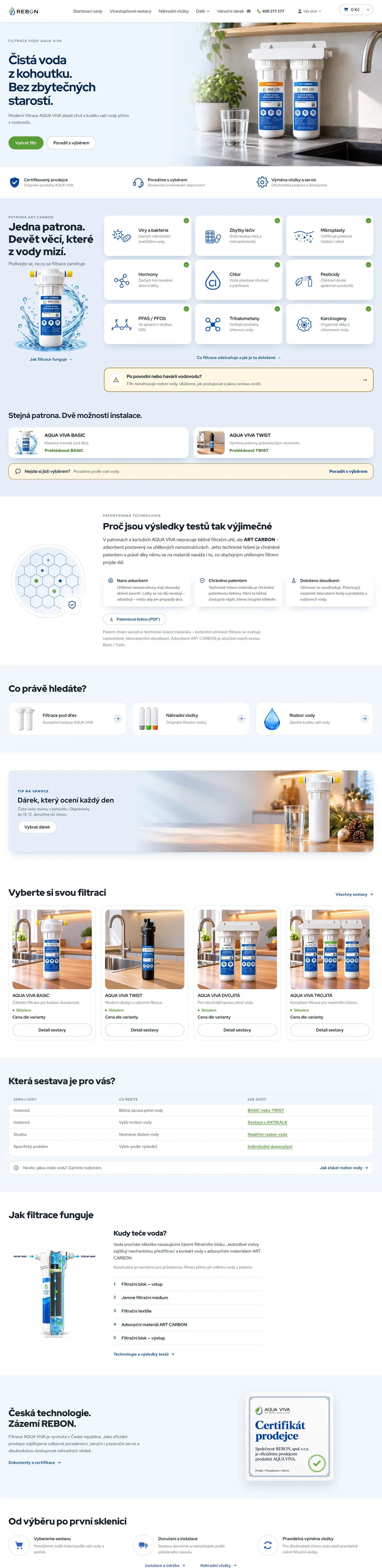
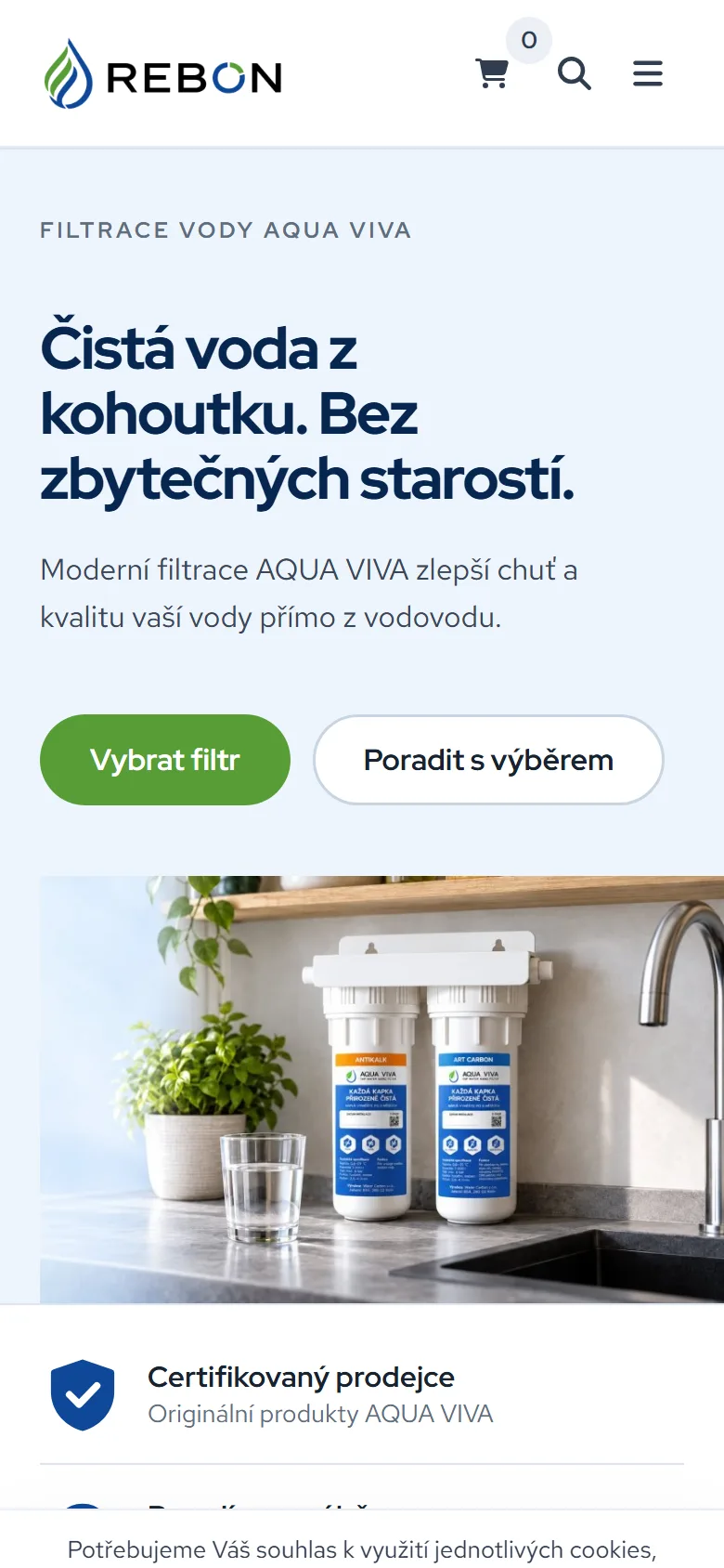
The store design and the product visuals are built on that base. Assemblies are shown where they actually sit — under the sink, on the worktop, beside a glass of water — so it is clear at a glance what the customer is buying and how much room it takes. Our sister studio Developer Online built the site from the design on the Upgates platform.
- Logo and brand
- Visual identity
- Store design
- Product visuals
- Photography art direction
- Content concept
Next project · AXA Racing
A website where the machines sell themselves →