A website that AI can read: what it means for design and build
A good-looking page can reach a machine empty. Four design decisions that cause it, and why none of this means building boring websites.
Case study · Brand and store
 Daniel Hauser
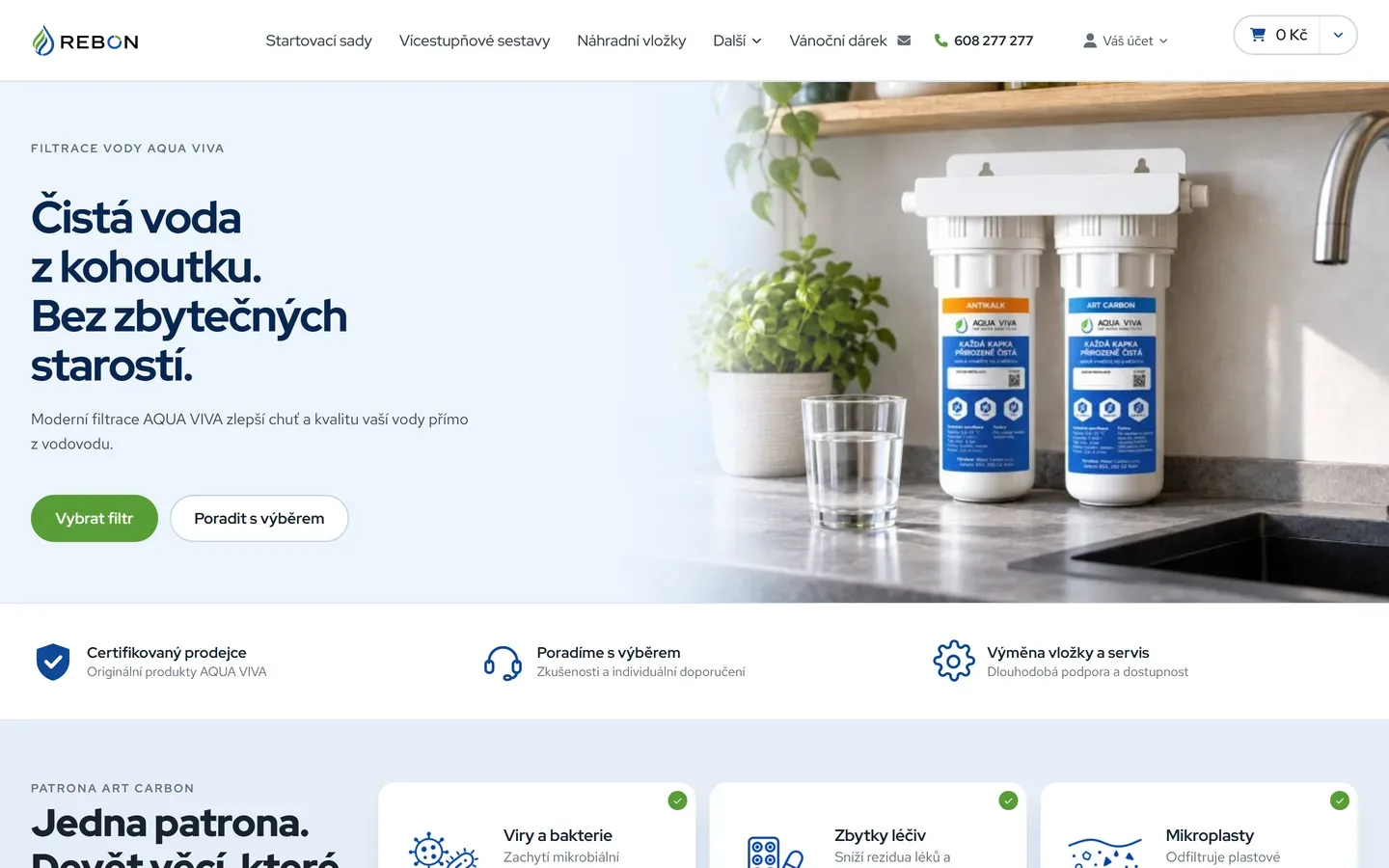
Water filtration is a product where the customer has no idea what they are actually buying. They do not know what is in their water, they do not understand the difference between cartridges, and they have no way of judging whether an offer is a good one. For a brand that means one thing: it has to answer before it starts talking about itself.
Rebon started from nothing. No logotype, no colour, no website. And it sells a product where it is easy to slide into a laboratory look — white backgrounds, blue, efficiency charts, certificates. That look feels expert, and for exactly that reason it does not work: the customer is afraid of their water, not interested in adsorbents.
We decided to go the other way. Not a laboratory but a kitchen. Not proof at first glance but reassurance.
The logotype rests on a single figure: a drop drawn in a blue line with green leaf strokes inside it. Water and nature in one shape, with no caption underneath. The same motif returns in the letter O of REBON, so the brand holds up where it has to fit inside a circle — a profile picture, a favicon, a label.
Everything else came out of that pair of colours. Blue carries water and trust, green carries naturalness and the sense that this is a solution rather than chemistry. We added nothing third.
With a technical product, design is not there to make it interesting. It is there to make it understandable before the person takes fright.
The product visuals show the assemblies where they actually sit: under the sink, on a kitchen worktop, beside a glass of water. There is a practical reason and a content one. Practical: the customer sees the size straight away and how much room it takes under the sink. Content: the photograph answers the question people ask first — will it fit, and will it look like a workshop?
The same rule governs the icons and diagrams. The filter block is drawn as the path of the water, not as a technical drawing. The nine things that leave the water each got an icon, so the overview can be read before it is read.
The design of the store was made alongside the structure of the pages, not after it. That difference shows in the result:
Our sister studio Developer Online built the site from the design on the Upgates platform. The content aimed at search was handled by Independency, who wrote their own take on structuring a store around search.
A brand that looks the same on the logotype, on a product photograph and on a page about well water. And a store where a person learns what they are buying before they reach the price. The whole project is in the Rebon reference.
Write a few lines about what you need. I will get back to you personally.
Discuss a project
A good-looking page can reach a machine empty. Four design decisions that cause it, and why none of this means building boring websites.
Since 23 October, Performance Max can pull up to ten videos from your social accounts and site into your ads. This is not an ad setting, it is a question of running a brand.
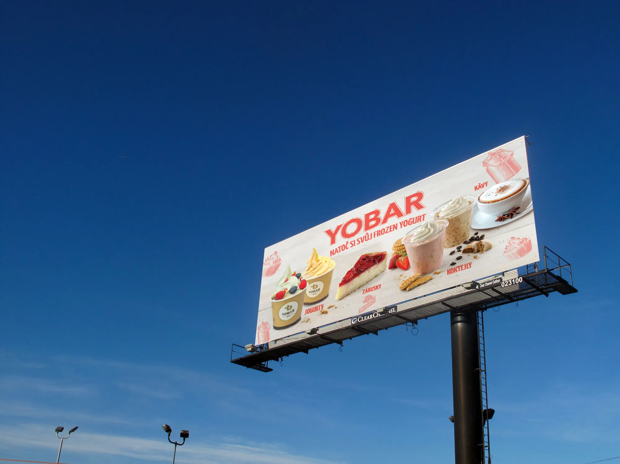
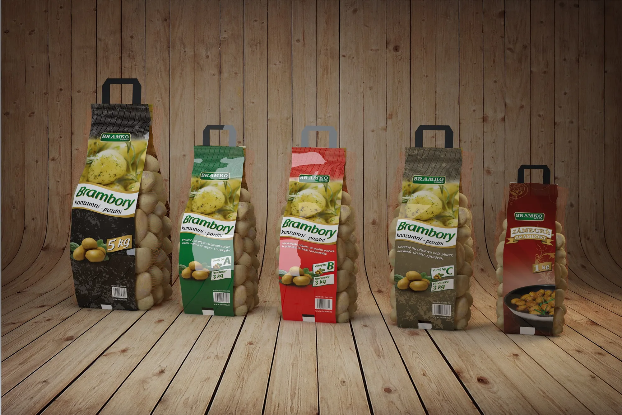
In an expansion the brand usually breaks before the campaigns do. What has to stay the same in every country, what has to bend, and why it is decided at the first pack rather than at the fifth market.
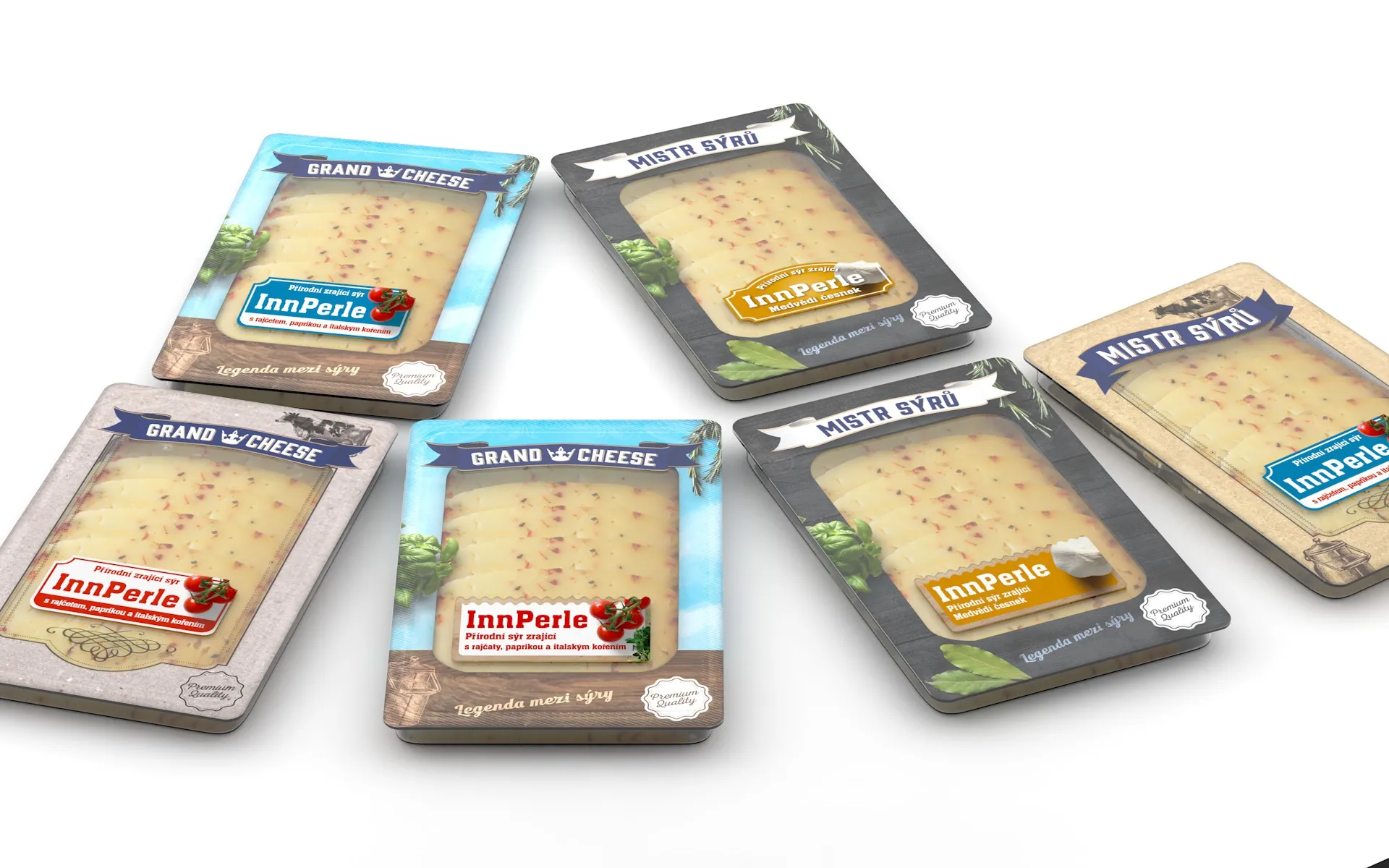
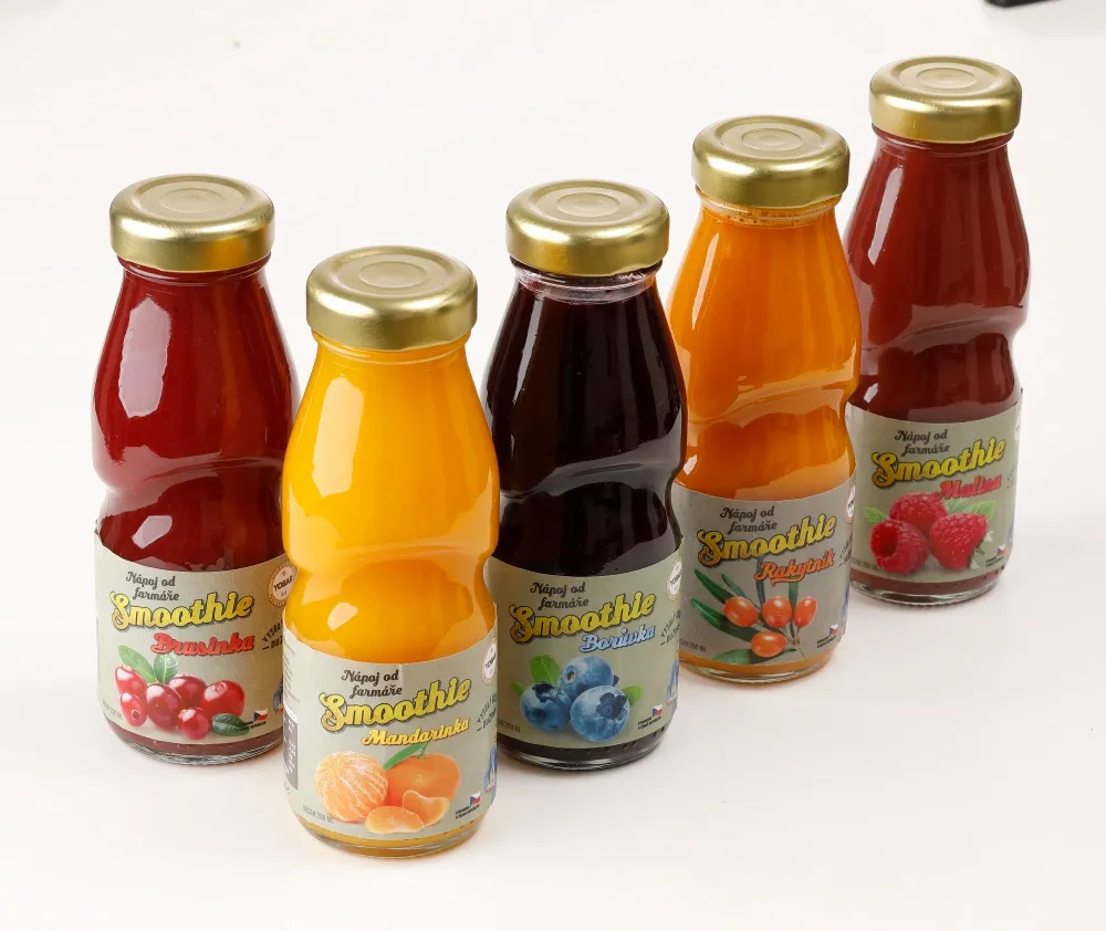
Most people now see packaging first as a small square in a comparison listing, not on a shelf. What survives being shrunk, what is lost, and why it has to be decided before anything is drawn.
When anyone can generate a smooth visual, smoothness stops meaning care. What that does to brands, where we let AI into our work and where a hand still touches paper.
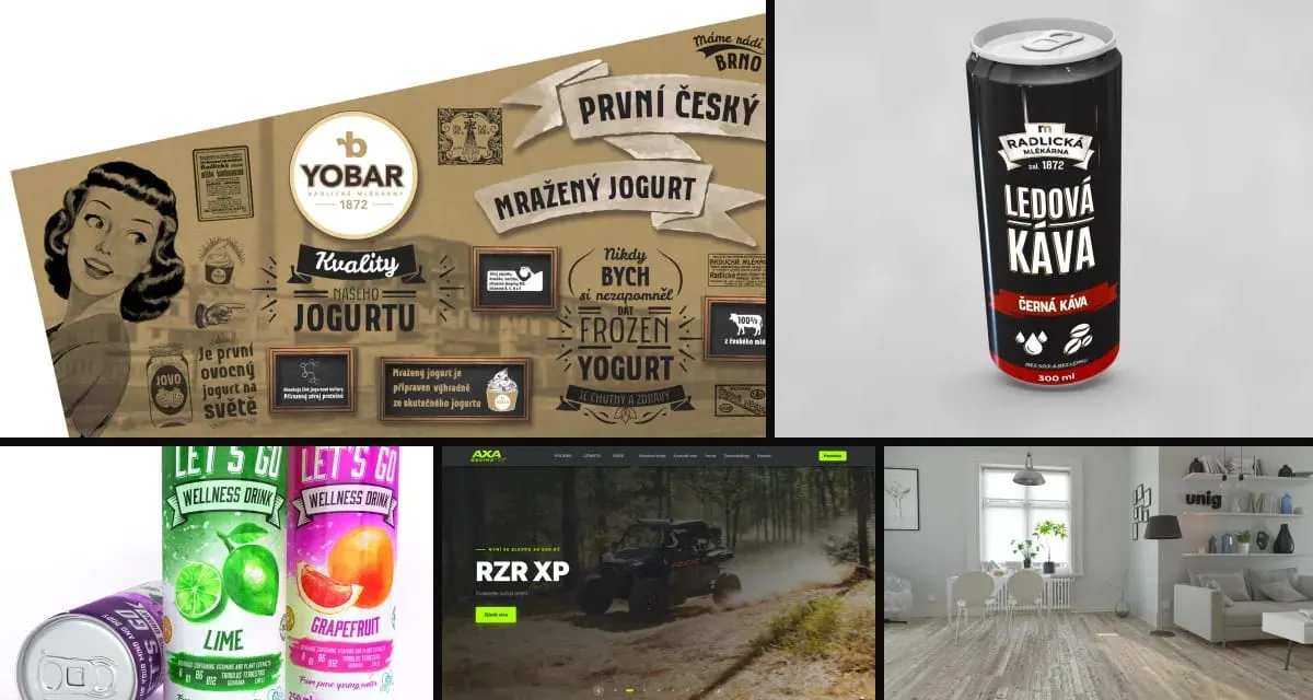
Why one experienced person with modern tools and a network of specialists often delivers more than a big agency, and why clients keep returning for years.
This site was built in eight languages in two days. Here is how our studio works with AI agents, what we built around them, and why humans make every call.
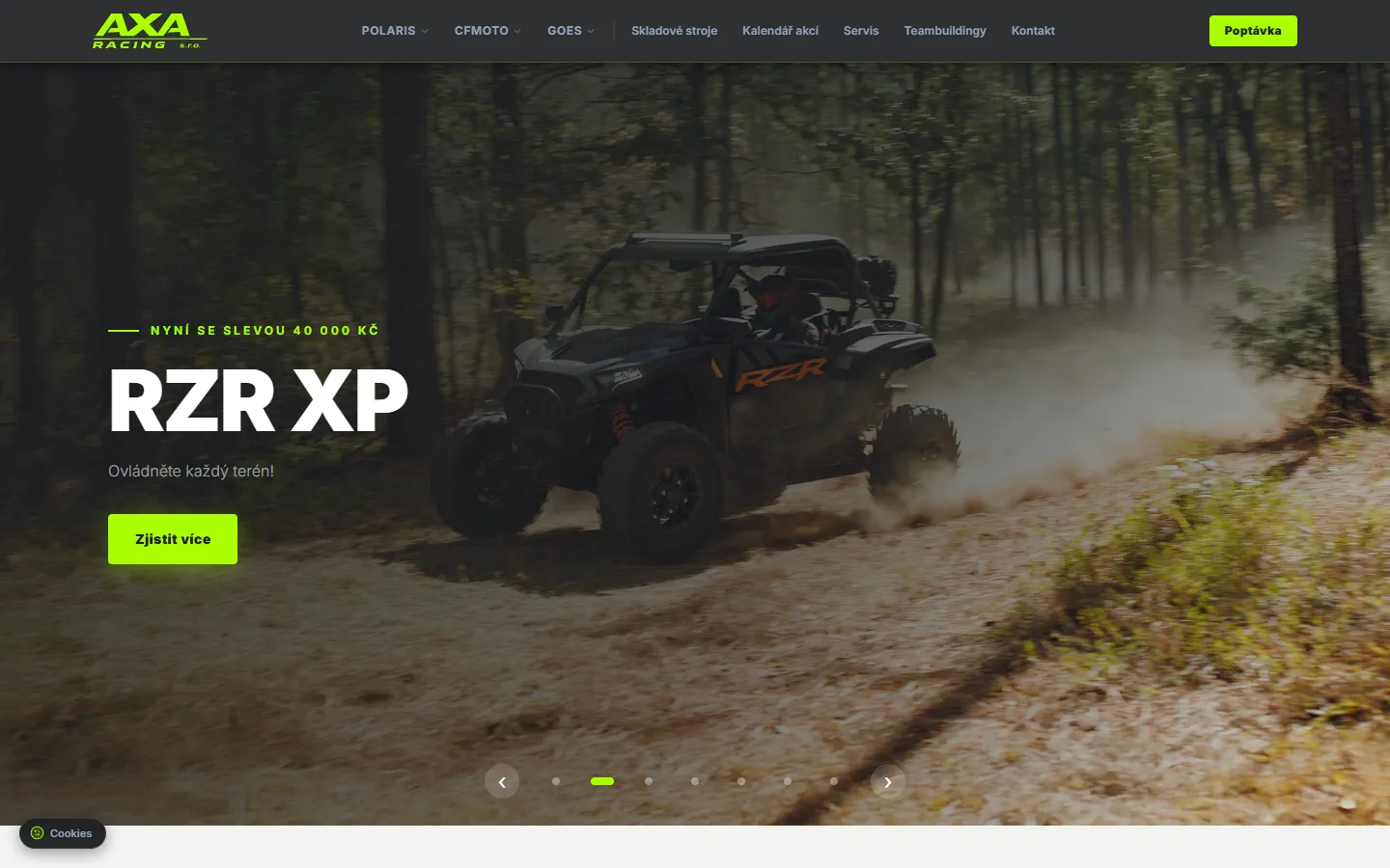
How we merged data from Polaris, CFMOTO and GOES into one dealer website with its own admin. Built on Next.js, first version live in three days.