Rebon: a brand for a product the customer does not understand
How to design a brand and a store for domestic water filtration so a layperson grasps what they are buying. From the logotype through product visuals to the design of the whole site.
Opinion · Craft and AI
 Daniel Hauser
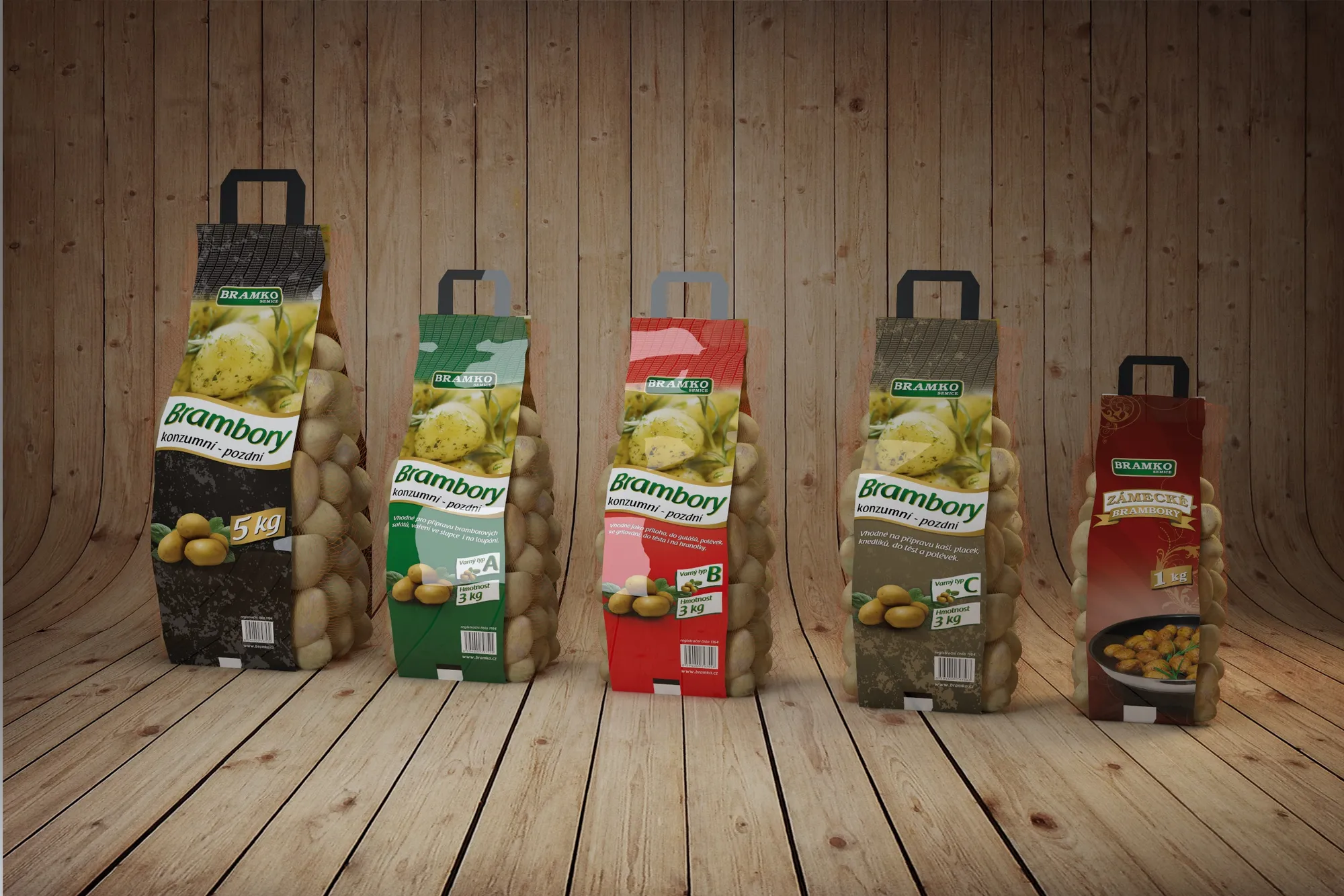
For ten years a smooth visual was proof of work. An even gradient, precisely tracked display type, a clean mockup. Nobody managed that in an afternoon, so when you saw it you knew someone had spent time on it. This year anyone generates it in a minute, and with that the message stopped being true.
Smoothness was never a value in itself. It was a shortcut that told you someone who knew what they were doing stood behind the packaging. It worked because it cost something. Once the cost disappears, so does the signal, even though the image still looks the same.
That is why we now see the opposite movement. The trace of a hand, grain, a crooked line, print that is not quite in register. Not as nostalgia, but as the one thing that cannot yet be pressed out of a button.
Imperfection only works when it is visible that you could have done the perfect version too.
That work can now be sloppy. Customers tell the difference between imperfection and carelessness immediately, even when they cannot name it. A hand-drawn crooked line is a decision. A crooked line because nobody could be bothered is just a crooked line.
That boundary is the whole craft. It rests on having been able to make the version you ended up not using.
We wrote about this in our article on how AI speeds up our work. With visuals it holds even more sharply than with code.
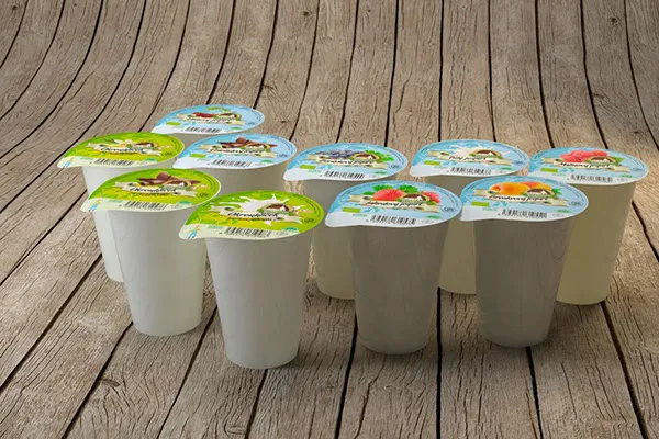
Packaging this year is talked about in two ways at once, and at first glance they contradict each other. So-called chaos packaging, raw, hand-written, smudged. And against it tactile minimalism, which goes for calm, a single material and touch.
They do not contradict each other. Both answer the same problem: how not to look like everything else that can be generated. One route adds a handwriting, the other removes everything unnecessary and bets on what you feel in your hand. A photo in an online shop cannot carry that across, which is exactly why competitors cannot copy it easily.
Which suits whom cannot be said across the board. If a brand rests on a story and a small batch, it carries a handwriting well. If it rests on being clean and dependable, chaos breaks it.
Perfection got cheap, so it stopped being an argument. What remains is a decision: what in the brand is made by a person, and why that part. It is a question for you as much as for us, and the answer shows on the packaging before anyone reads a word of it.
Write a few lines about what you need. I will get back to you personally.
Discuss a project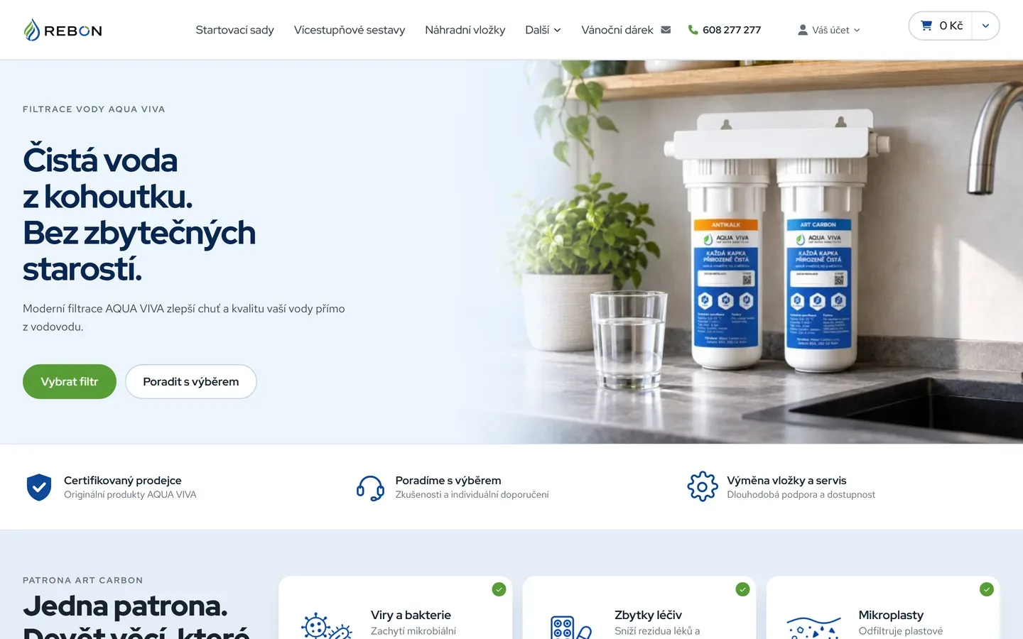
How to design a brand and a store for domestic water filtration so a layperson grasps what they are buying. From the logotype through product visuals to the design of the whole site.
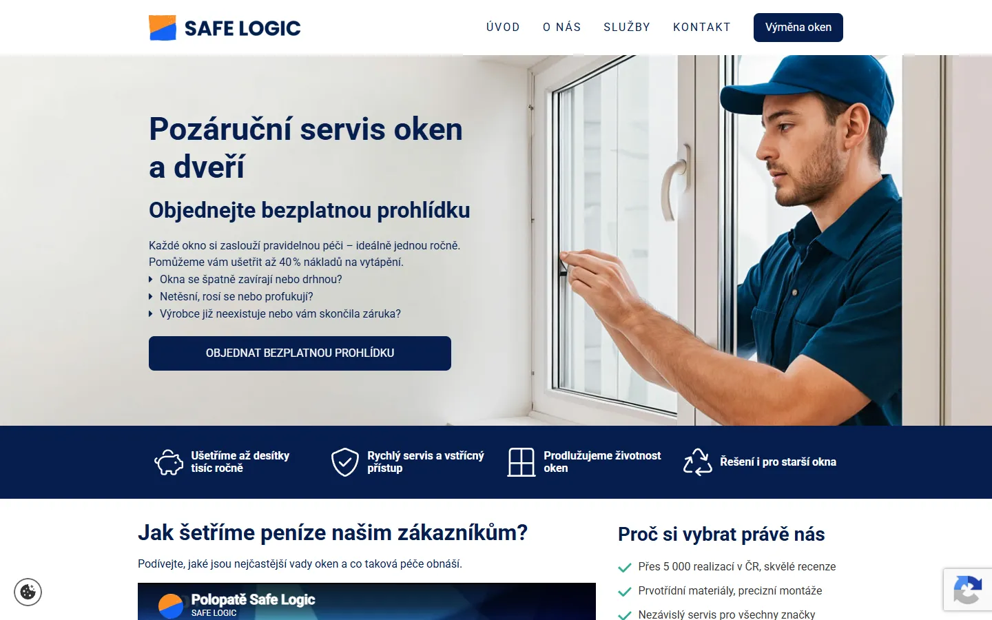
A good-looking page can reach a machine empty. Four design decisions that cause it, and why none of this means building boring websites.
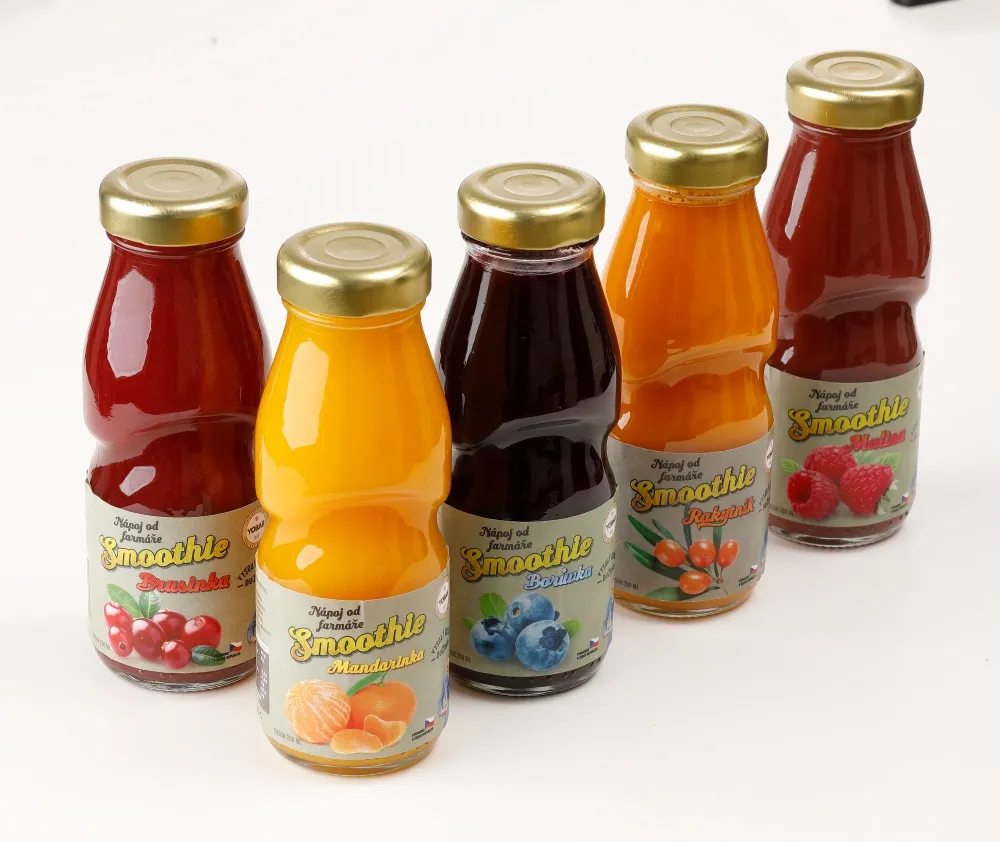
Since 23 October, Performance Max can pull up to ten videos from your social accounts and site into your ads. This is not an ad setting, it is a question of running a brand.
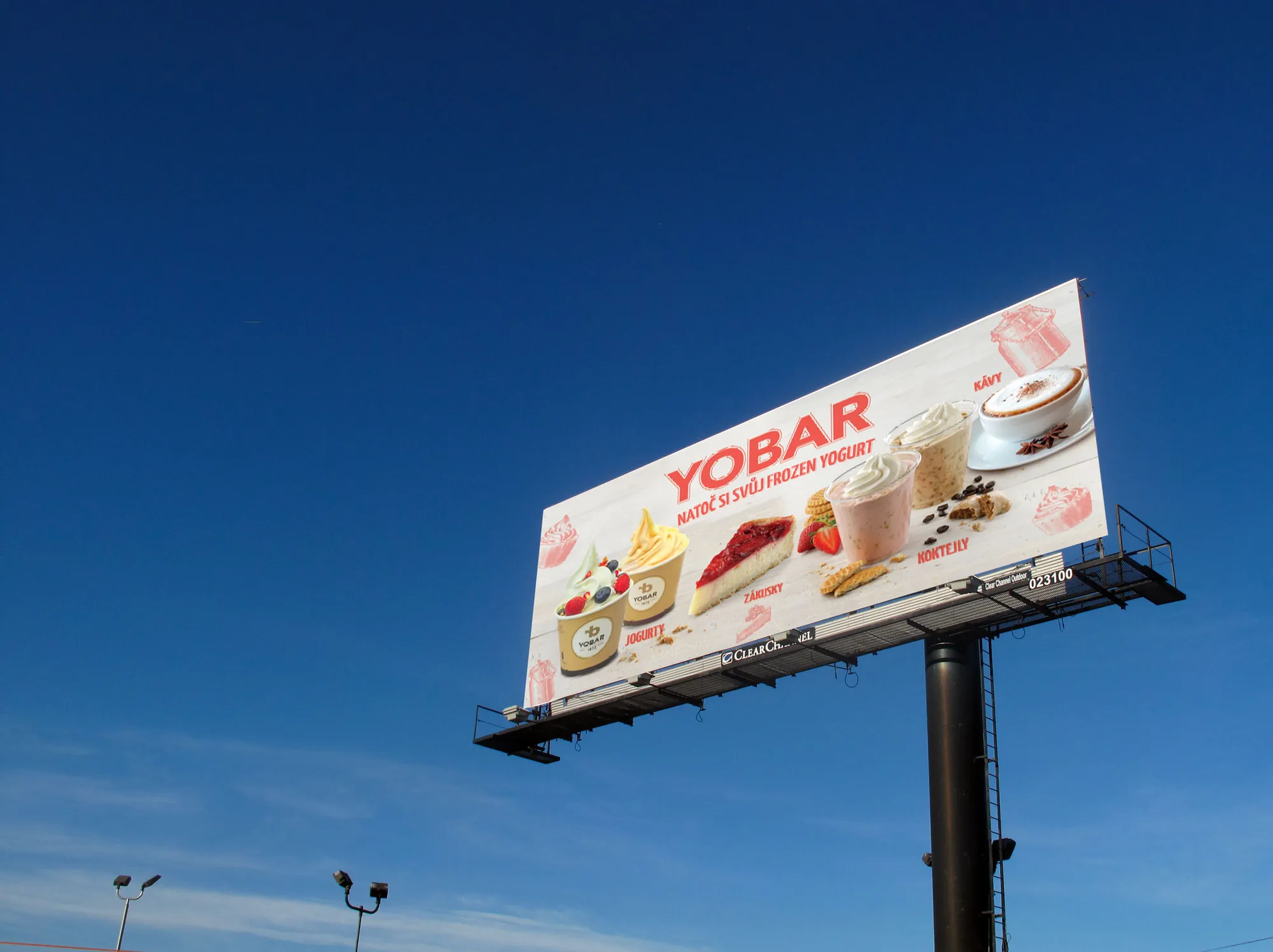
In an expansion the brand usually breaks before the campaigns do. What has to stay the same in every country, what has to bend, and why it is decided at the first pack rather than at the fifth market.
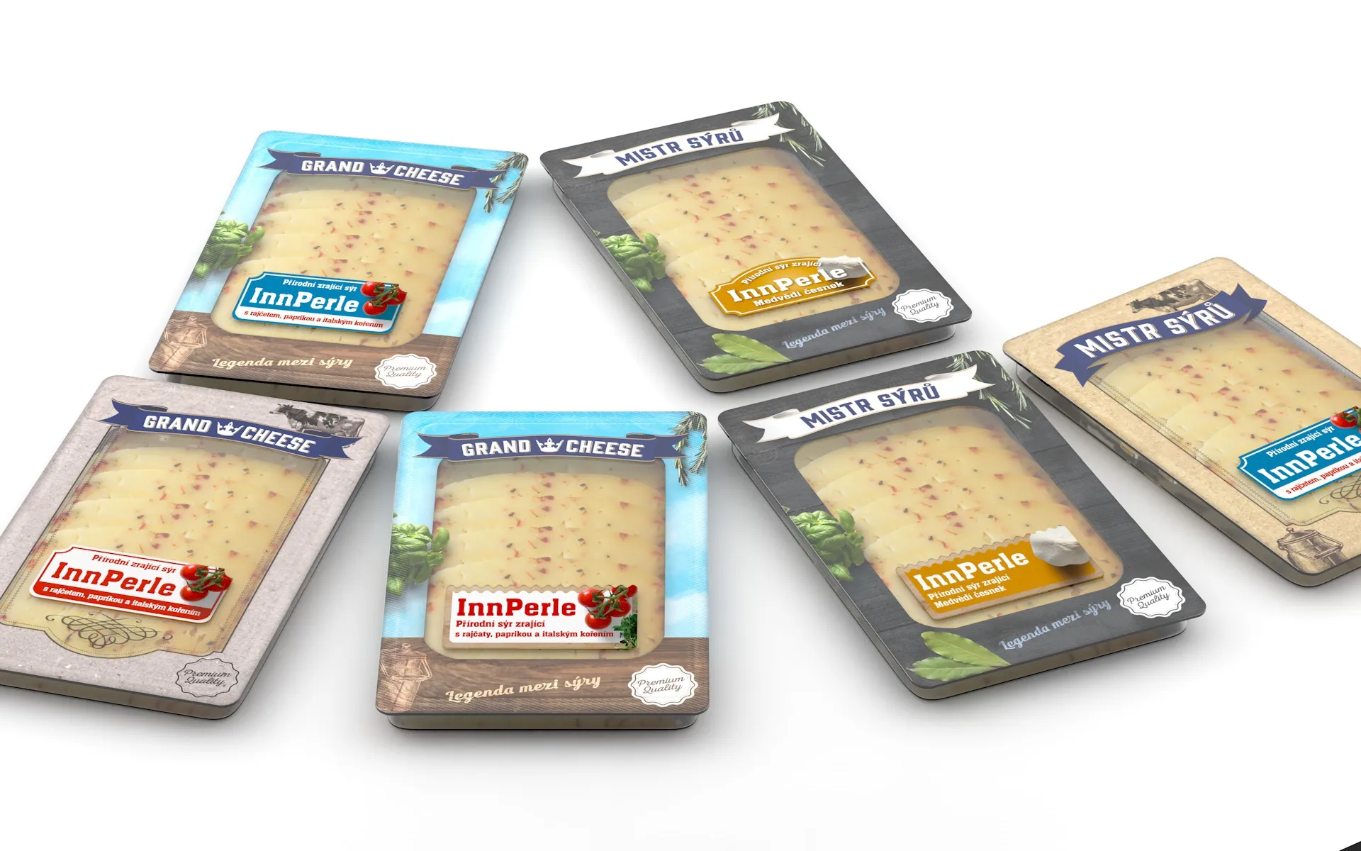
Most people now see packaging first as a small square in a comparison listing, not on a shelf. What survives being shrunk, what is lost, and why it has to be decided before anything is drawn.
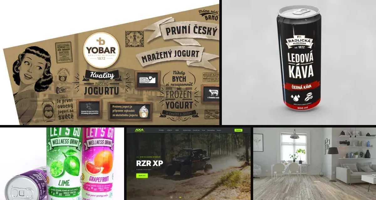
Why one experienced person with modern tools and a network of specialists often delivers more than a big agency, and why clients keep returning for years.
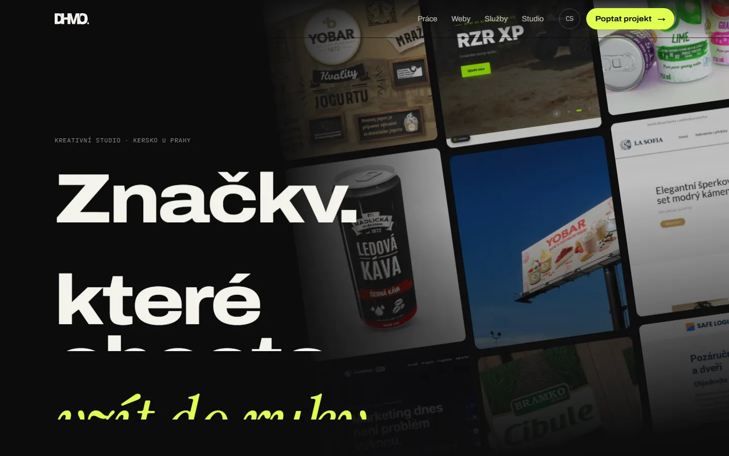
This site was built in eight languages in two days. Here is how our studio works with AI agents, what we built around them, and why humans make every call.
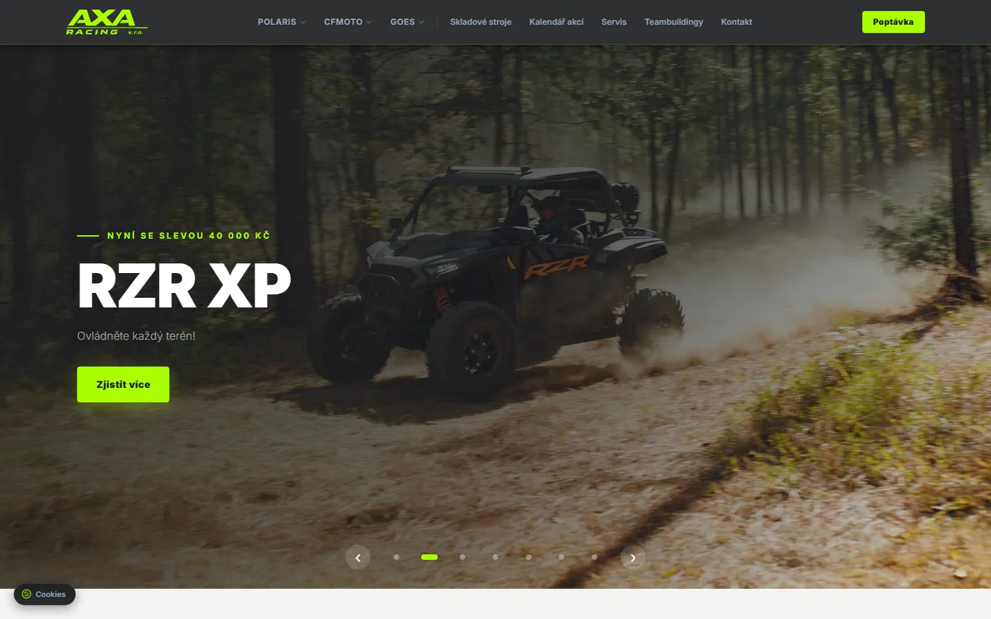
How we merged data from Polaris, CFMOTO and GOES into one dealer website with its own admin. Built on Next.js, first version live in three days.