Rebon: a brand for a product the customer does not understand
How to design a brand and a store for domestic water filtration so a layperson grasps what they are buying. From the logotype through product visuals to the design of the whole site.
Opinion · Branding and expansion
 Daniel Hauser
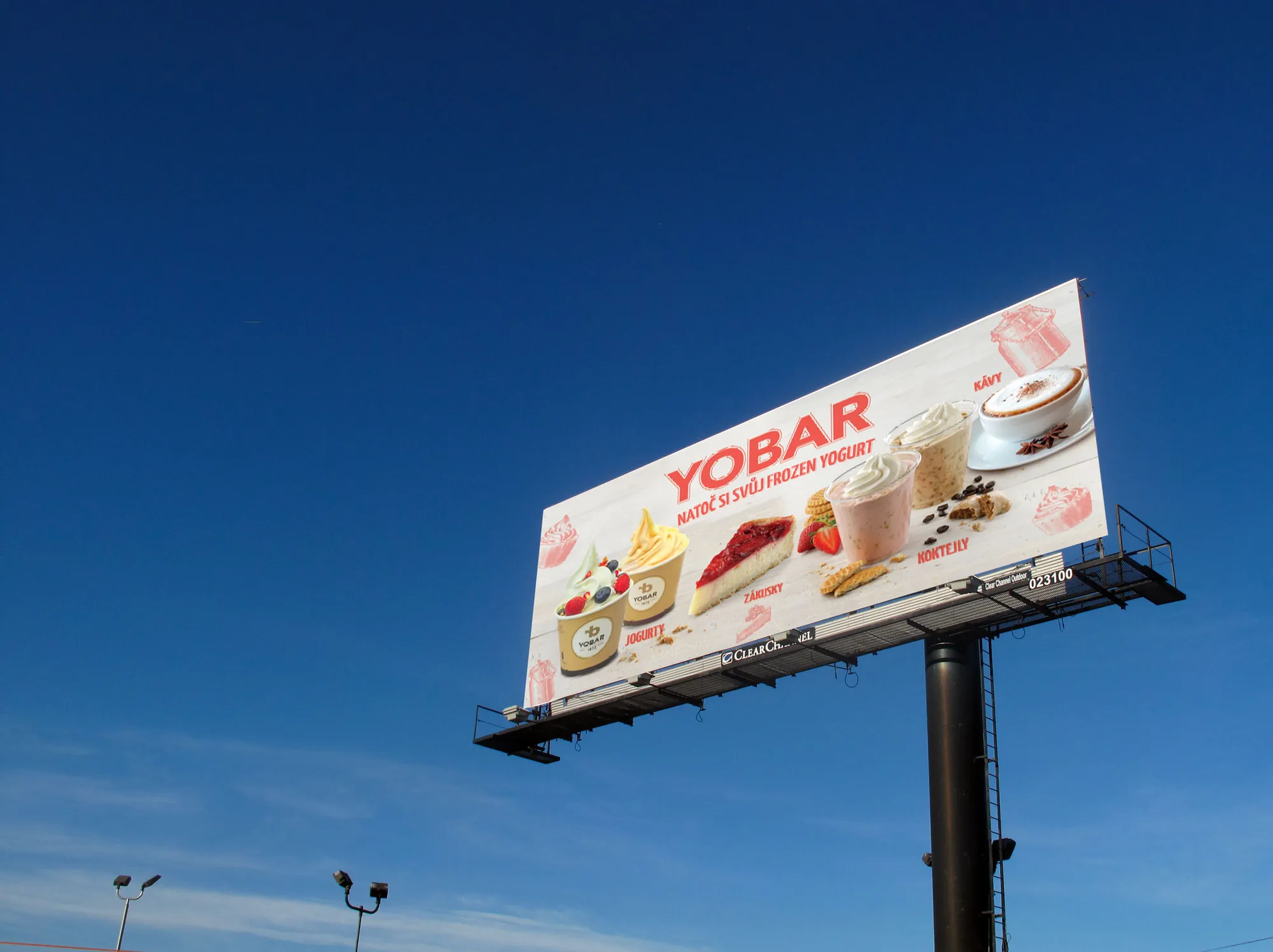
Expanding into another country is usually planned as a commercial step. Website language, shipping, prices, campaigns. The brand does not appear in that plan, because the assumption is that it will simply be translated. And that is exactly where it breaks first.
A brand that can take several markets keeps two layers clearly apart. One never changes, the other always does. When that line is not written down, someone different decides it in every country, and by the third market nobody can tell it is one brand.
One brand across several markets. Not eight brands that resemble each other.
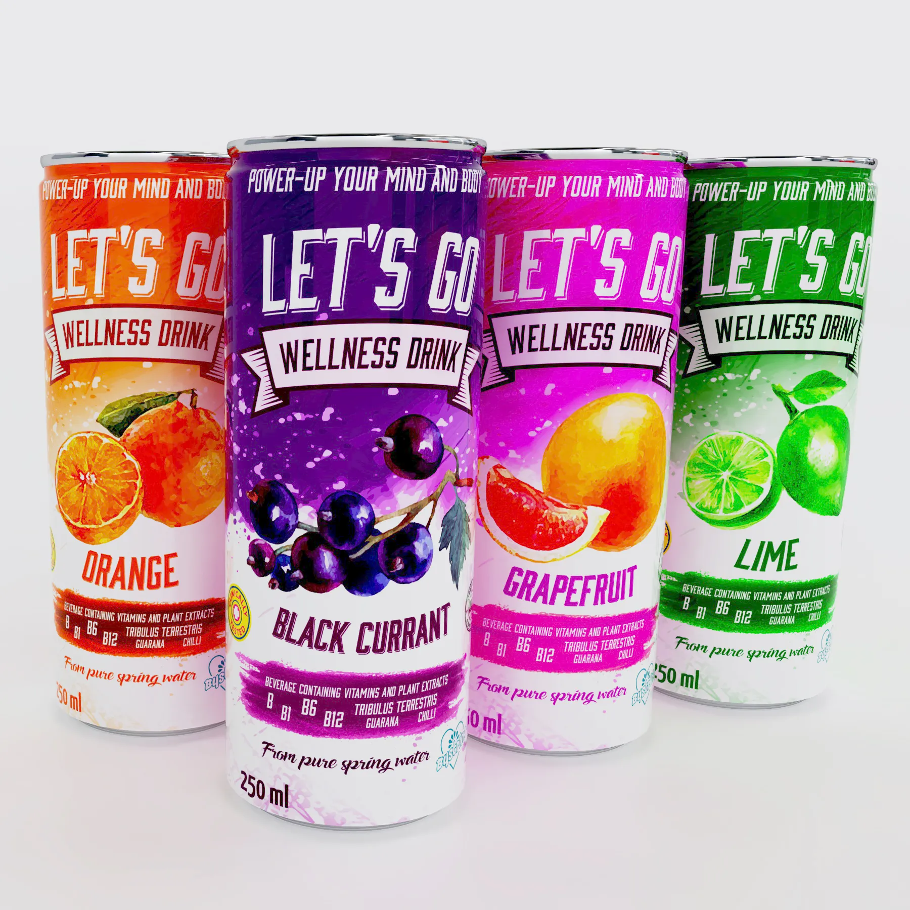
The most common practical problem we see is room. Mandatory information differs between countries in how much there is and in how many languages it has to appear. When a design was made for one market, the back of the pack usually has just enough space, and once more languages arrive either the type shrinks below legibility or the whole back has to be rebuilt.
The specific obligations differ by country and by category, so check them with the producer or a lawyer. From a design point of view one thing matters: assume there will be more text than today's market needs. Spare room on the back is cheaper than a second round of pre-press.
A customer spots a translated claim immediately, even when they cannot name what is wrong. Translation carries words but not rhythm, and not what sounds self-evident in that country. For a brand name and a claim it pays to write again rather than translate, and to have someone who really speaks the language read it.
That is precisely the part that cannot be left to a machine. We wrote about it in Handmade vs AI-Perfect: routine yes, the thing you are recognised by no.
On the advertising side this has been settled for years and it lands in the same place: one skeleton for every market, and different only what the market dictates. We cover it in One campaign structure for every market, and what such an expansion looks like in practice is on campaign management at Independency.
It is the same idea carried over to packaging. Keep the same what you are recognised by. Let differ what the market forces.
Expansion does not fail because a website cannot be translated. It fails because the brand bends everywhere nobody thought about it. Separate the core from the wrapping in advance, and the second and third market become two weeks of work rather than a new brief.
Write a few lines about what you need. I will get back to you personally.
Discuss a project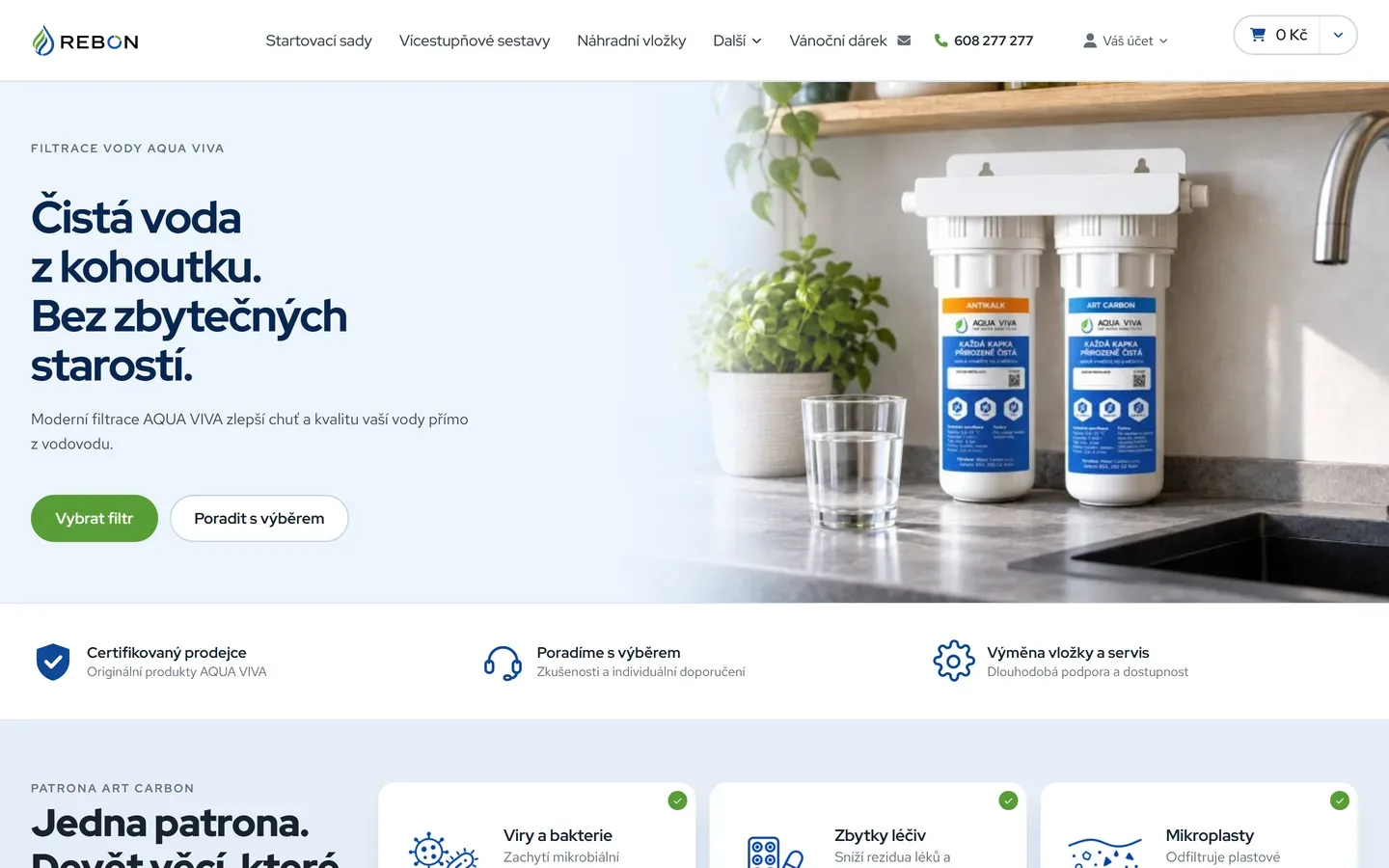
How to design a brand and a store for domestic water filtration so a layperson grasps what they are buying. From the logotype through product visuals to the design of the whole site.
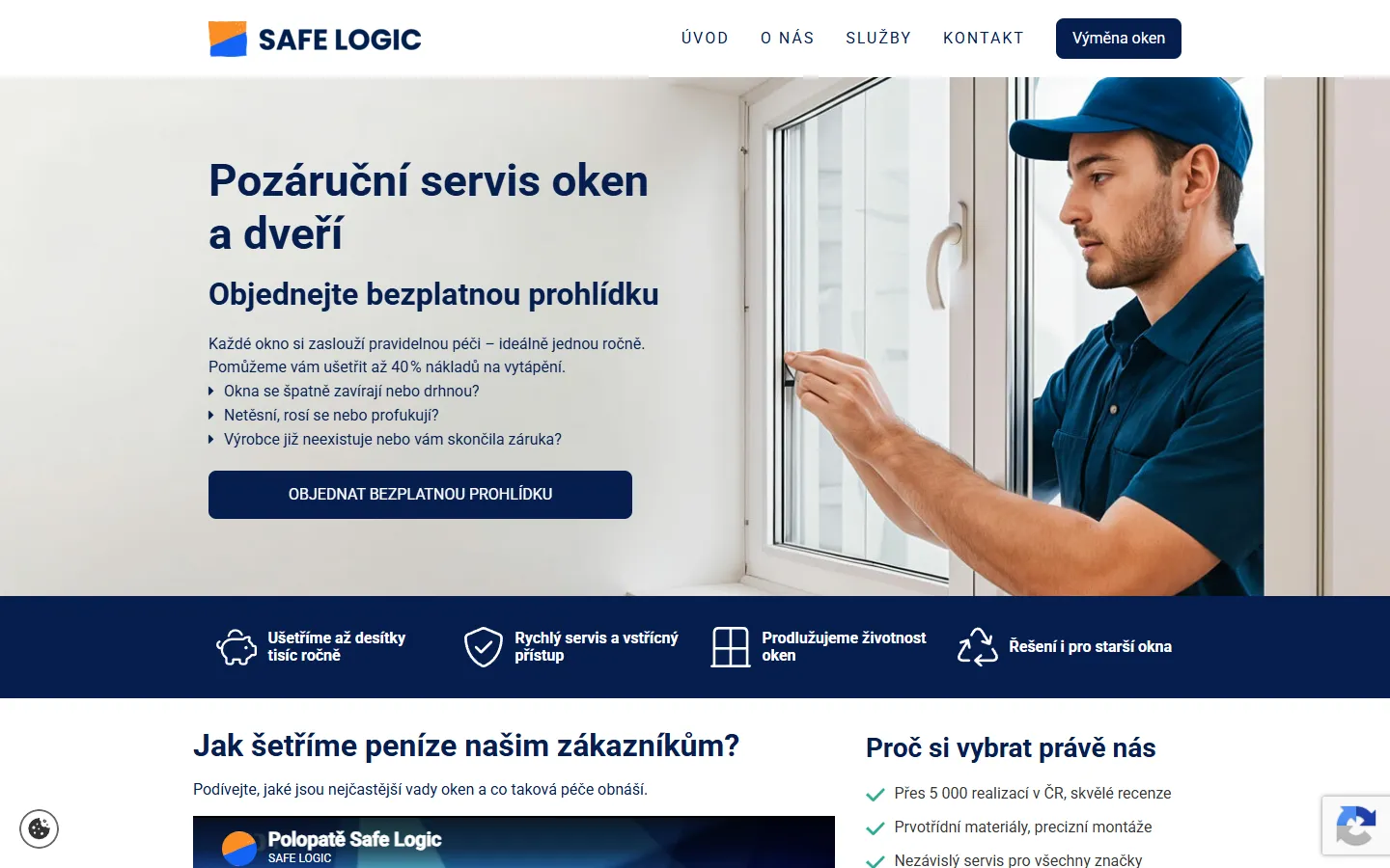
A good-looking page can reach a machine empty. Four design decisions that cause it, and why none of this means building boring websites.
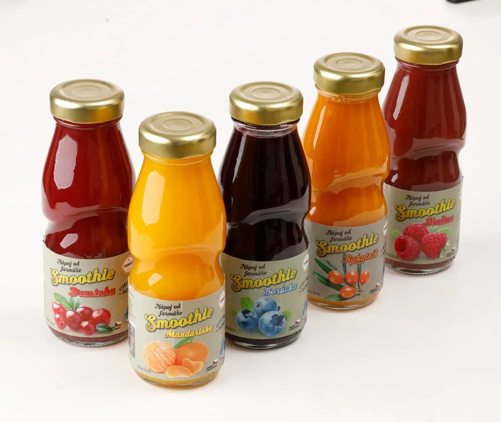
Since 23 October, Performance Max can pull up to ten videos from your social accounts and site into your ads. This is not an ad setting, it is a question of running a brand.
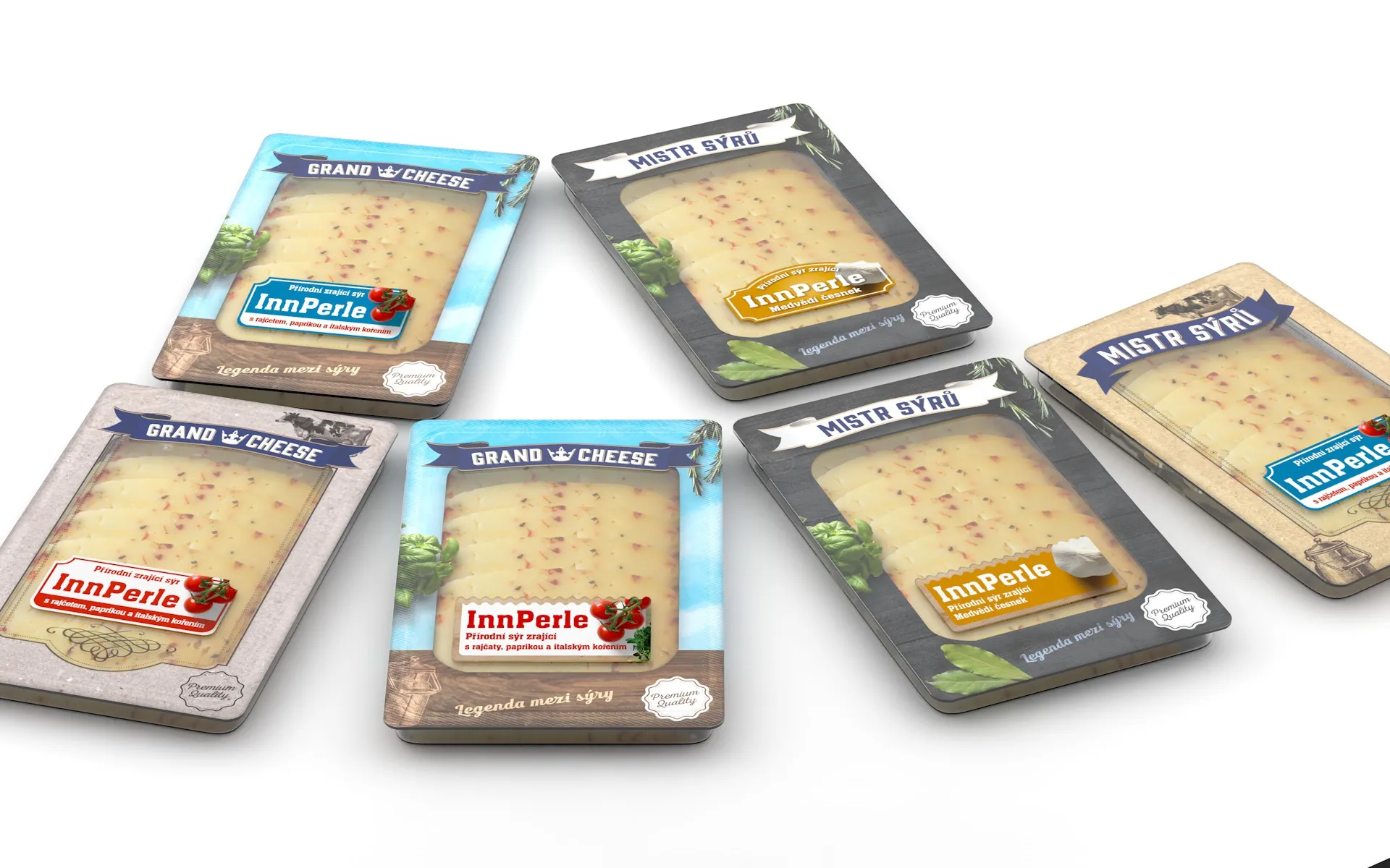
Most people now see packaging first as a small square in a comparison listing, not on a shelf. What survives being shrunk, what is lost, and why it has to be decided before anything is drawn.
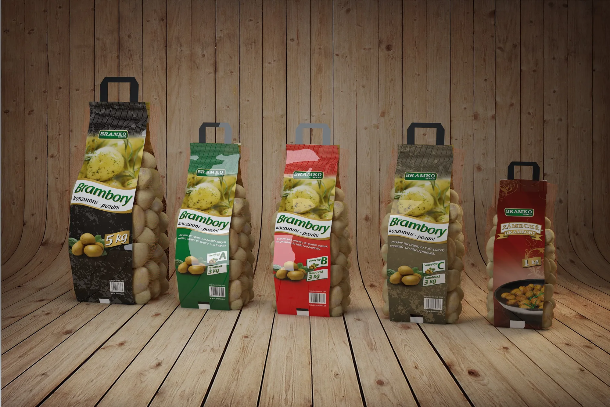
When anyone can generate a smooth visual, smoothness stops meaning care. What that does to brands, where we let AI into our work and where a hand still touches paper.
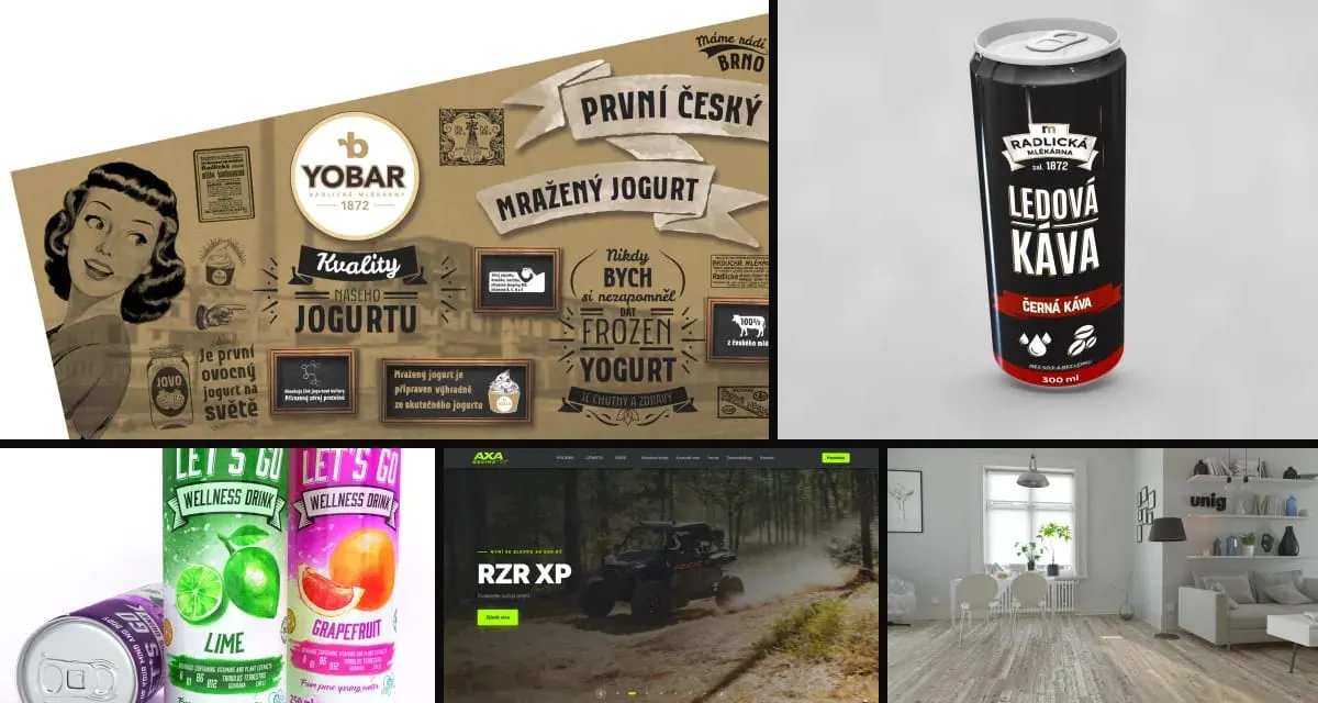
Why one experienced person with modern tools and a network of specialists often delivers more than a big agency, and why clients keep returning for years.
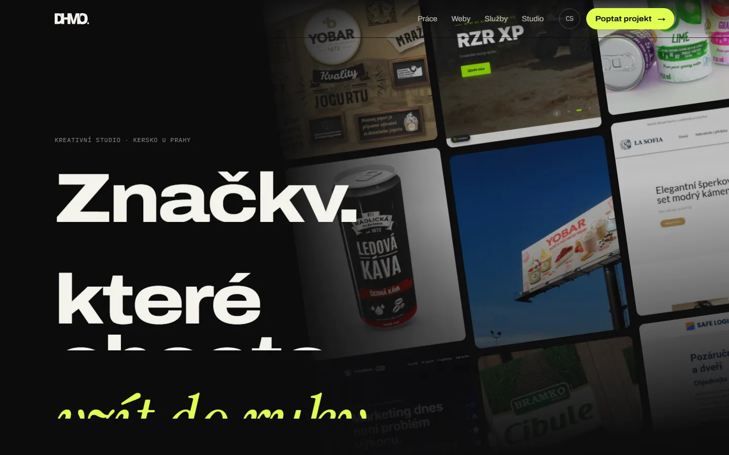
This site was built in eight languages in two days. Here is how our studio works with AI agents, what we built around them, and why humans make every call.
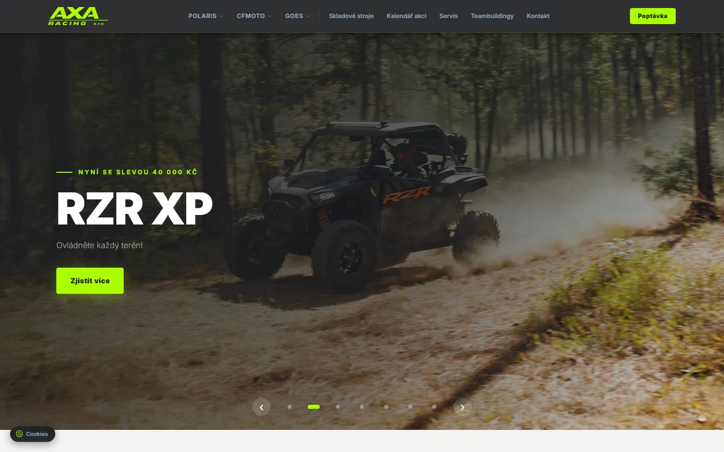
How we merged data from Polaris, CFMOTO and GOES into one dealer website with its own admin. Built on Next.js, first version live in three days.