Rebon: a brand for a product the customer does not understand
How to design a brand and a store for domestic water filtration so a layperson grasps what they are buying. From the logotype through product visuals to the design of the whole site.
Opinion · Packaging and selling
 Daniel Hauser
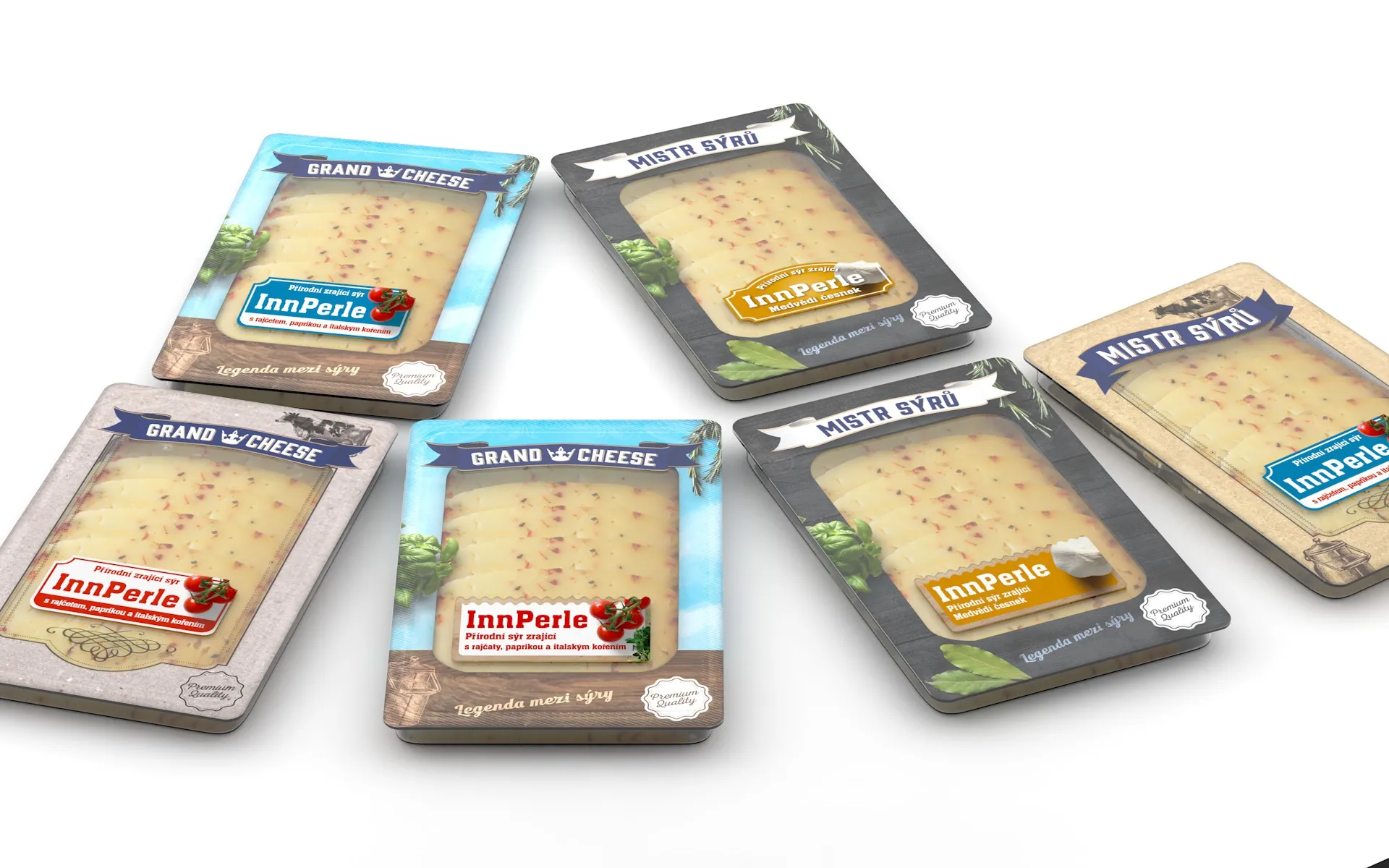
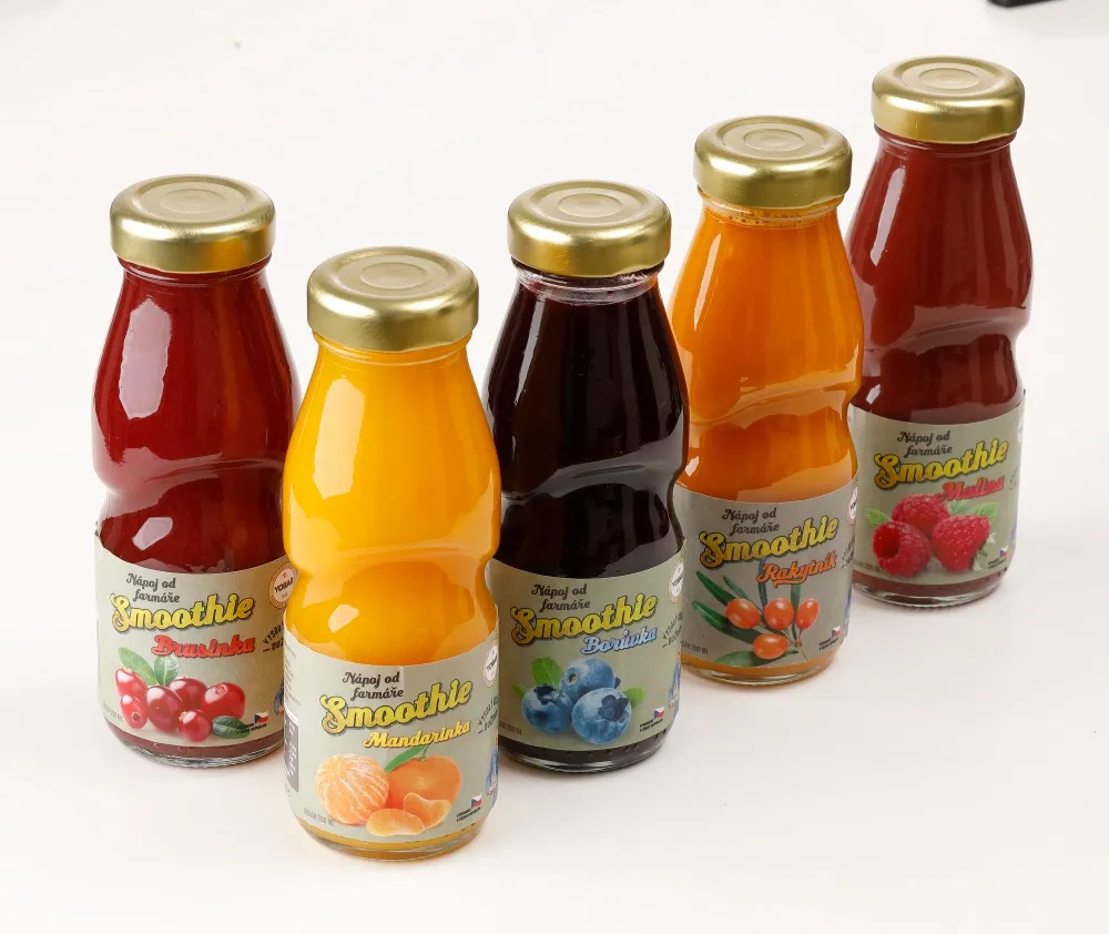
Packaging is designed for the shelf. That is how it is taught and how it is presented: a visualisation in the aisle, lighting, neighbours left and right. Except most people today see that packaging first somewhere else. As a square the width of a finger in a comparison listing, next to twenty others, on white, without any context at all.
Comparison engines have been the first contact with a brand for a long time. This year two things were added: Heureka released a browser extension that compares prices directly on top of someone else's online shop, and Seznam launched shopping with an agent on Zboží.cz that picks items and fills the cart. In both cases there is one more layer between your packaging and the customer, a layer that reads data and shows a thumbnail.
It does not mean the shelf is over. It means a design that works only in print and only close up is a design for a minority of situations.
Everything that goes through the hand and through light. Embossing, spot varnish, the texture of the paper, registration, matt against gloss. A photograph does not carry it across, and a thumbnail two centimetres wide certainly does not.
That is awkward mainly because those are exactly what one of the two directions we wrote about in Handmade vs AI-Perfect bets on. Tactile minimalism is excellent in the hand and weak in a thumbnail. That is not a reason not to do it, but it is a decision made deliberately rather than by accident.
Packaging has to win twice. Once as a square and once in the hand. Most designs only deal with the second.
In a comparison listing it is not only how the packaging looks that decides, but whether the data gets there at all. The main image, the title, the category and the identifier come from the product feed, and when something is missing or does not match, the product fails to join the catalogue and appears nowhere, however good the packaging is.
That is no longer a designer's job, but it belongs in the same conversation. To see what a feed is missing, the free feed check at aitoolkit.cz goes through it, and what breaks in it during expansion or a shop migration is covered in this article.
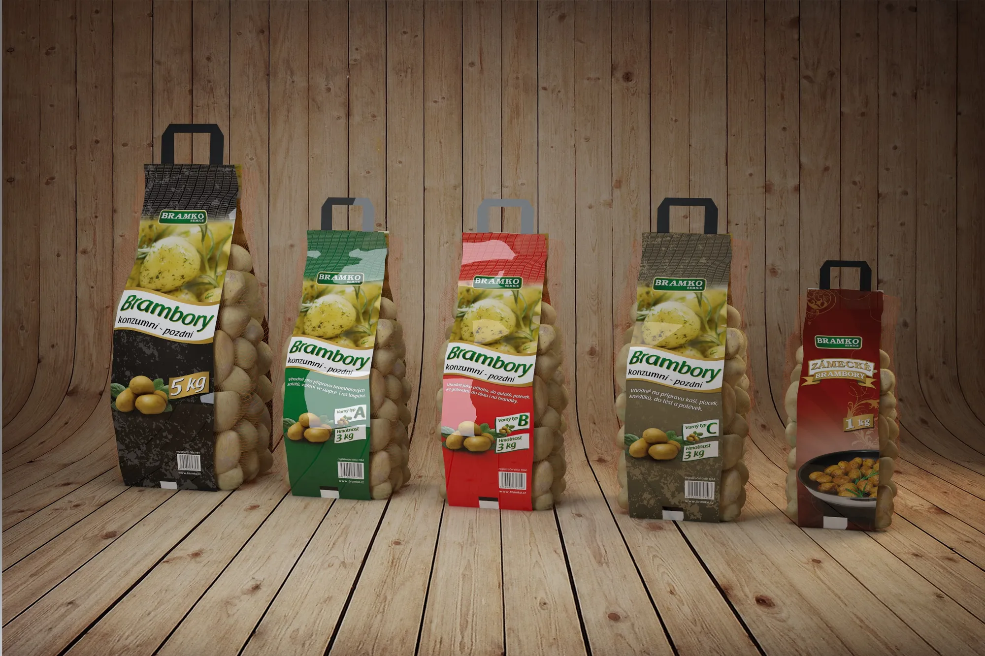
Tell the studio where the product will be sold before anything is drawn. Packaging for your own shop with large photographs and packaging that has to succeed in a listing next to twenty others are not the same thing. The two can be reconciled, but that is a decision at the start, not an adjustment at the end.
And ask to see the design shrunk. A lit visualisation in the aisle is lovely and tells you little about how it will actually go.
Write a few lines about what you need. I will get back to you personally.
Discuss a project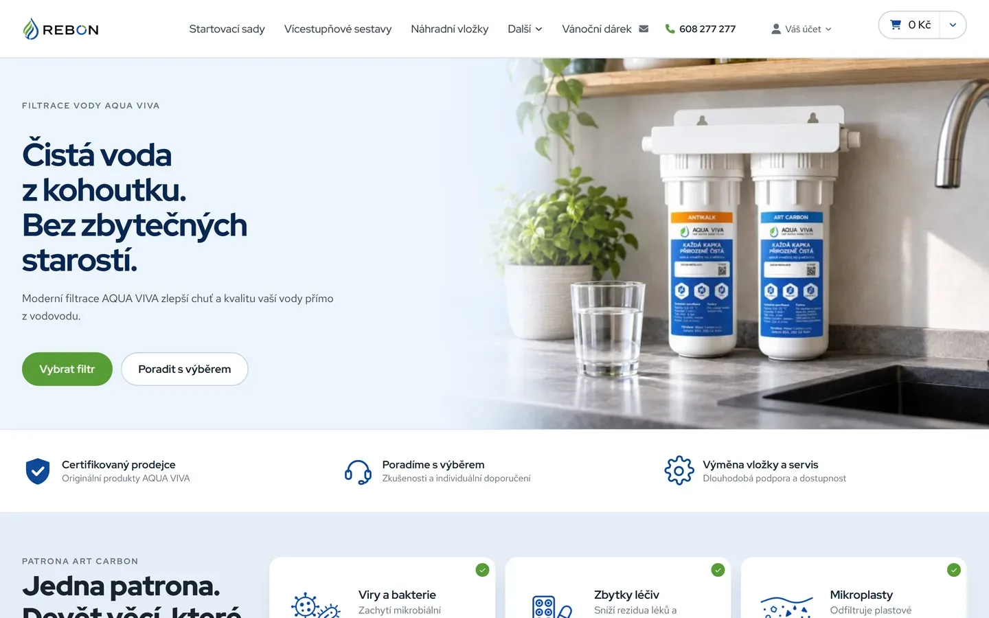
How to design a brand and a store for domestic water filtration so a layperson grasps what they are buying. From the logotype through product visuals to the design of the whole site.
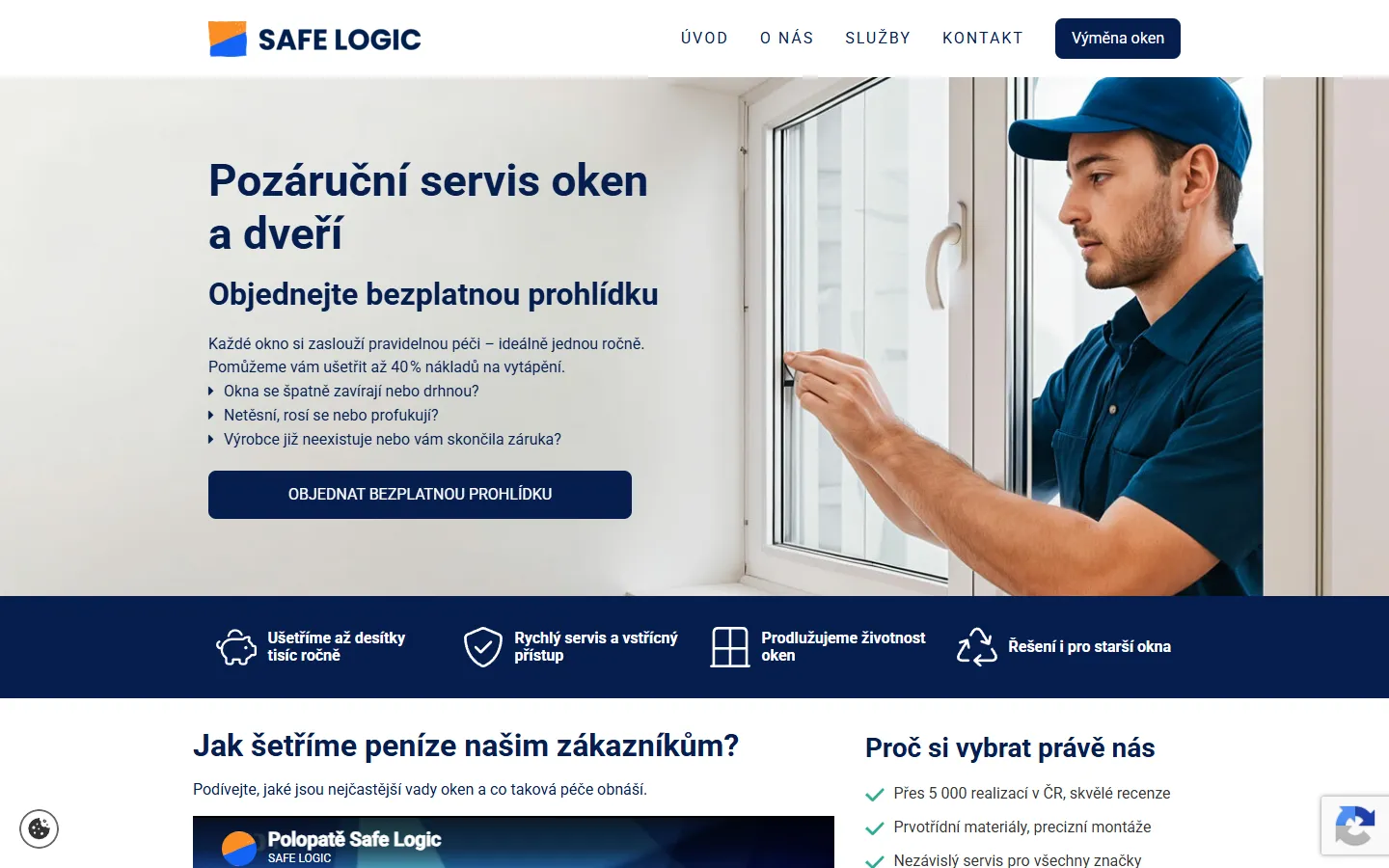
A good-looking page can reach a machine empty. Four design decisions that cause it, and why none of this means building boring websites.
Since 23 October, Performance Max can pull up to ten videos from your social accounts and site into your ads. This is not an ad setting, it is a question of running a brand.

In an expansion the brand usually breaks before the campaigns do. What has to stay the same in every country, what has to bend, and why it is decided at the first pack rather than at the fifth market.
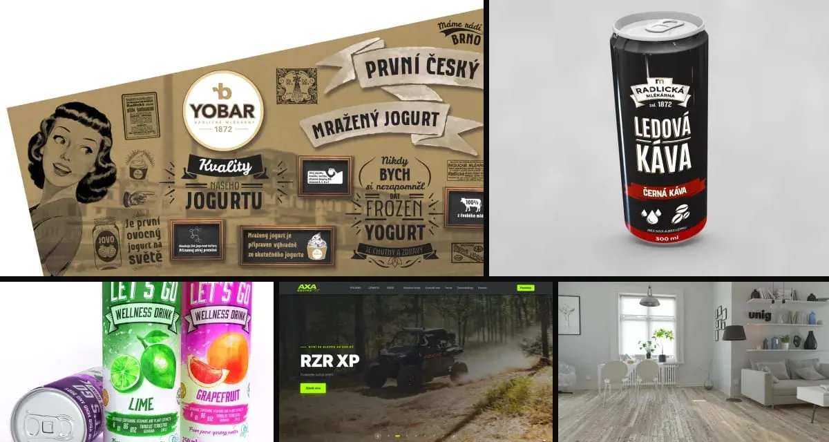
When anyone can generate a smooth visual, smoothness stops meaning care. What that does to brands, where we let AI into our work and where a hand still touches paper.
Why one experienced person with modern tools and a network of specialists often delivers more than a big agency, and why clients keep returning for years.
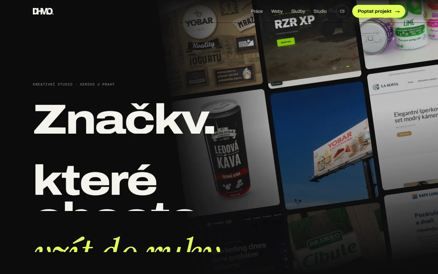
This site was built in eight languages in two days. Here is how our studio works with AI agents, what we built around them, and why humans make every call.
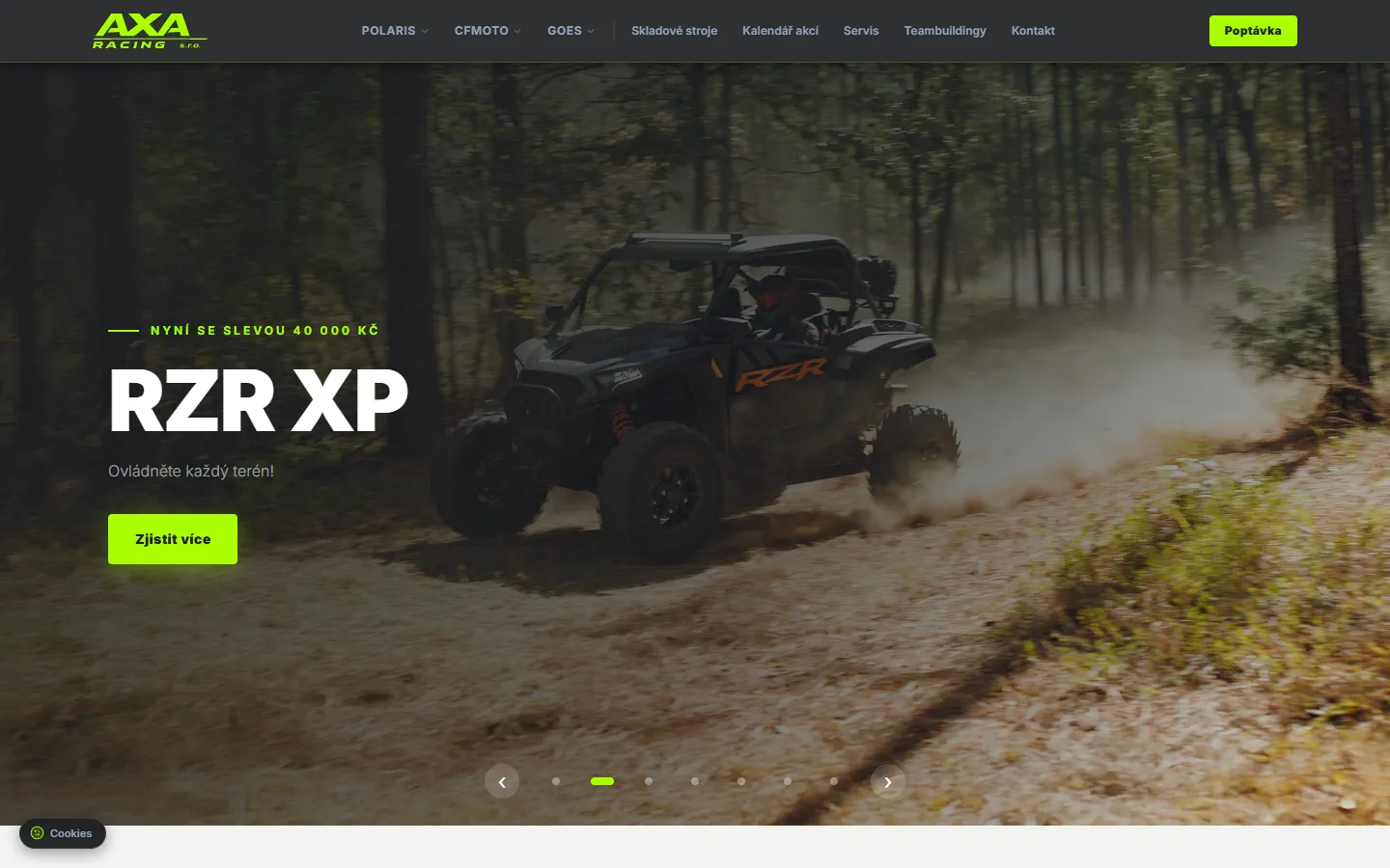
How we merged data from Polaris, CFMOTO and GOES into one dealer website with its own admin. Built on Next.js, first version live in three days.